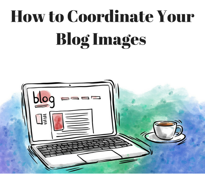
How to Coordinate Your Blog Images for a More Cohesive Aesthetic.
You may have noticed that bloggers use photos differently, with varying degrees of success. Images can either enhance the clean and professional image of a blog or they can make the blog look more amateurish – the difference is in the execution. How do some bloggers keep things looking so unified and cohesive?
Experienced bloggers have to approach the use of images the way a magazine would. Magazines and other professional publications create their own style guides to define the pre-publication processing of each image so that their graphics and photography can look somewhat unified despite coming from different sources.
This guide will help you create your own image style and layout standards – a set of “rules” you can follow to ensure that your use of images enhances the aesthetics and authority of your blog.

- Attitude
Eclectic styles look good when done right but most bloggers should try to stick with a theme. If your blog mostly uses bright and colourful photos with white backgrounds, and you throw a dull cellphone-camera shot in there, that one lifeless photo will stick out like a sore thumb. You might encounter the same situation if you typically post screenshots and logos but decide to include traditional photography.
Some bloggers find themselves “trapped” in a look they do not want – such as bloggers that start using a cool filter but then switch phones or cameras and cannot easily recreate it. Some bloggers find themselves having trouble integrating colour photography because they’re so used to using black and white images.
The importance of unity and cohesion is why you should choose a theme or general image style that you really truly enjoy. Fashion blogs often employ the great use of vintage photo filters and ethereal colours, tech bloggers often use a combination of typographic art and digitally rendered graphics, corporate bloggers tend to use smartly composed and stylized stock photography, etc.
- Sizing
Don’t trust your blog editor to re-size those photos for you. Automatic re-sizing/thumbnail features might make your page look right at first glance but those full-size images will still be kicking around on your website or server somewhere, increasing load time. Speed is highly valued by search engines and readers alike. Compressing and re-sizing images only take seconds of your time but saves a lot of bandwidth and hosting space.
Edit your photos by hand, leaving them large enough to look good on large monitors, but small enough to load quickly on slow connections. Use on-site formatting to adjust the sizes from there. Take some time to read up on image formatting so that you can tell social media websites which photos (and which sizes) to grab.
- Create Presets
The only thing worse than poorly formatted images is having a blog that seems visually sparse. Bloggers who feel intimidated by style guides might feel tempted to reduce their overall number of images in favour of better images – putting an emphasis on quality is definitely the right move, but you don’t have to sacrifice aesthetics just to save time. Make the editing process as fast as possible by using presets instead of relying on memory.
You might have to read the help section on your favourite photo editor to learn how to set up the presets in the first place, but this effort will save you a tremendous amount of time on each post. Automate the tasks defined in your style guide by creating presets for things like brightness, compression, contrast, colour balance, etc. There are plenty of options out there but my favourite app is Snapeal: you can adjust photo values with the press of a button.
Help to standardize your image formatting by using a few pre-set image sizes. Have a good variety: a wide and thin feature photo, small square photos for the left or right in-content spots, and a long vertical size for all photos or detailed infographics. Use the mathematics of the golden ratio in conjunction with your blog layout to determine the most aesthetically pleasing sizes for your images.
Get Excited!
Creating your own style guide is time well invested. Adopt the tactics of professional magazine editors by optimizing and coordinating your image usage – you’ll love the look of the results.
